
| Theme | The overall look of a contact row
|
Theme overrides
Tweak the themes with a few additional options.
| Style Social Links | Add the official color to social icons (e.g. blue for Facebook...), overriding the icon color |
| Row | |
|---|---|
| Background image | Card background image (has precedence over the background color overrides) |
| Background color | Card background color (overrides the theme’s background color) Leave blank to keep the theme’s original color |
| Background color 2 | 2nd background color to create gradients. Leave blank to keep the theme’s original color |
| Font | The font to use for the card (standard web fonts or Google fonts) |
| Font size reference | The font size the whole card is based on (in pixels) |
| Font color | The overall text color Leave blank to keep the theme’s original color |
| Fields | |
| Icon font size | The icon font size (in em). Relative to the font size reference |
| Icon font color | Choose the icon color to use |
| Icon font background color | The background color of the icon |
| Headers column width | The column width for the headers when the headers show in a single column (when the table transforms into a mobile view)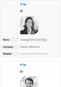 |
| Label color | The color of the label when in mobile view |
| Label background color | The background color of the label when in mobile view |
| Links | |
| Icon font size | The icon font size (in em). Relative to the font size of the card |
| Icon font color | The color of the icon |
| Icon font background color | The background color of the icon |
| Other | |
| Additional CSS | An easy way to include additional styles
Example |