Themes
| Style | The overall look of a news item
|
||||||||||||||||
| Color scheme | An optional color scheme to apply to the style
|
||||||||||||||||
Theme overrides
| Background Color | The overall background color | ||||||||||||||
| Border width | The item's border width | ||||||||||||||
| Border radius | The item's border radius | ||||||||||||||
| Border color | The item's border color | ||||||||||||||
| Shadow | The item's shadow
Warning When adding shadows, the item's content width is reduced with the space taken by the shadows. For instance, if item width is 300px and the shadow is 10px wide, the content width will be 300 - 10 - 10 = 280px. |
||||||||||||||
| Space to border | The distance between the content of the item and it's outer limit 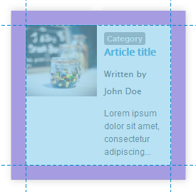 |
||||||||||||||
| Font color | The item's font color. Leave blank to use the template's styling. Leave blank to use the template's or color theme's color | ||||||||||||||
| Link color | The item's link color. Leave blank to use the template's styling. Leave blank to use the template's or color theme's color | ||||||||||||||
| Link hover color | The item's link color when hovering over it. Leave blank to use the template's or color theme color's | ||||||||||||||
| Font size reference | The reference size of the text for the whole item, except for the calendar head. 0 will set the size to the template’s default |
||||||||||||||
| Head | |||||||||||||||
|---|---|---|---|---|---|---|---|---|---|---|---|---|---|---|---|
| Space around | White space that surrounds the 'head' element (leave empty to keep the style's default)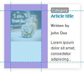 |
||||||||||||||
| Body | |||||||||||||||
| Space around | White space that surrounds the 'body' of the item (leave empty to keep the style's default)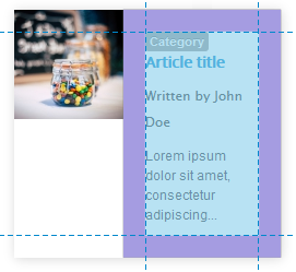 |
||||||||||||||
| Joomla 4 Title classes |
The CSS classes that can be used to skin the title. For instance, using fw-bold will bold the title if the template is based on Bootstrap 5 |
||||||||||||||
| Information | |||||||||||||||
| Font | The font for the blocs of information. Joomla 4 The extension supports the GDPR-compliant web fonts from fonts.bunny.net. To select the service (Google is the default), go to the SimplifyYourWeb extensions System plugin and select the web font service you wish to use. |
||||||||||||||
| Font size | The font size in comparison to the font size of reference | ||||||||||||||
| Line spacing | The height (px or em) given to each line allowing spacing of the lines of information | ||||||||||||||
| Font color | The text color. New v4.13 When you do not select a color, the text color is the same as the introductory text |
||||||||||||||
| Pro Font color over head |
The text color for information placed over the head (image or video) | ||||||||||||||
| Icons color | The color of the icons, when icons are shown. New v4.13 When you do not select a color, the icon color is the same as the introductory text |
||||||||||||||
| Pro Icons color over head |
The color of the icons placed over the head (image or video), when icons are shown | ||||||||||||||
| Pro Improve contrast |
When showing information over images, the text may be hard to read. Enable this functionality to add a background gradient and text shadow. Before:  After:  |
||||||||||||||
| Read more link | |||||||||||||||
| Style | The link style, following the theme default style or using Bootstrap (Bootstrap is the default for backward compatibility) | ||||||||||||||
| Bootstrap type | The link type (as defined by Bootstrap)
|
||||||||||||||
| Bootstrap size | The size of the label (as defined by Bootstrap)
|
||||||||||||||
| Classes | The CSS classes that can be added to the link (space separated). Example New 6.0 Example Use |
||||||||||||||
| Categories | |||||||||||||||
| Style | The link style, following the theme default style or using Bootstrap | ||||||||||||||
| Bootstrap type | The link type (as defined by Bootstrap)
|
||||||||||||||
| Bootstrap size | The size of the label (as defined by Bootstrap)
|
||||||||||||||
| Classes | The CSS classes that can be added to the link (space separated). Example New 6.0 Example Use |
||||||||||||||
| Read all link | |||||||||||||||
| Style | The link style, following the theme default style or using Bootstrap | ||||||||||||||
| Bootstrap type | The link type (as defined by Bootstrap)
|
||||||||||||||
| Bootstrap size | The size of the label (as defined by Bootstrap)
|
||||||||||||||
| Classes | The CSS classes that can be added to the link (space separated). Example New 6.0 Example Use |
||||||||||||||
Other overrides
| CSS overrides | Simple CSS tweaks that can be added and applied to the module. The code is minified automatically to be as small as possible. Styles must be prefixed with #lnee_[your module id] in order to affect the module instance only.Prefix styles with .lnee to affect all instances on the page.Check the user stylesheets section for more information. Example #te_23 .field { text-align: center; } |


