| Module Layout | The module layout used to create the output.
Pro Layouts included in the LatestNewsEnhanced plugins will appear, as well as their template overrides. 
|
||||||||||||
| No data message | Message that is shown when no data is available. Leave blank to hide the module from users when there is nothing to show |
||||||||||||
| Layout | The overall layout for all the items
|
||||||||||||
| Items spacing | The alignement for the items, using CSS Flexbox. Flexbox is not used when items are included in a carousel or when using the 'leading items' functionality
|
||||||||||||
| Items alignment | The alignment of the items
|
||||||||||||
| Space between | The minimum space between the items | ||||||||||||
| Overall width | The container width (leave blank unless needed for specific non-responsive configurations) | ||||||||||||
| Overall height | The container height (leave blank unless needed for specific non-responsive configurations) | ||||||||||||
| Pro v4+ Use leading items |
Present a certain number of items with full configuration, the remaining items having a limited one | ||||||||||||
| Leading items | |||||||||||||
|---|---|---|---|---|---|---|---|---|---|---|---|---|---|
| Pro Leading count |
The number of news items that contain all layout elements. Leave blank or 0 for all items to have the same layout | ||||||||||||
| Degraded / Remaining items | |||||||||||||
| Pro % of item width |
The width of the items that are 'incomplete' compared to the width of the items that are complete. Example |
||||||||||||
| Pro Remove head |
Removes the image or the calendar | ||||||||||||
| Pro Remove text |
Removes the intro text | ||||||||||||
| Pro Remove details |
Removes the detailed information | ||||||||||||

Example of one item with full configuration followed by items without head (image), text or detailed information
All items
| Item width | The width of an item |
| Item width unit | The unit for the item width. Use percentages to show multiple items in several columns and rows |
| Min item width | The minimum width of a news item. It forces the news item to stop 'shrinking' under a certain width when the page is resized. Leave blank when degraded items are less than 100% of the complete item width |
| Max item width | The maximum width of a news item |
Head
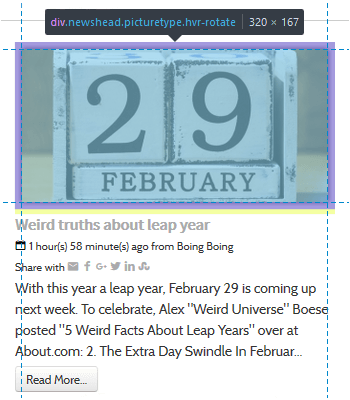
This is an element that shows next to the item's introductory text.
| Head type |
|
||||||||||||||||||||||||||||||||||||||||
| Removed in v4+ Author picture |
The picture to show as author picture
|
||||||||||||||||||||||||||||||||||||||||
| Pro Search fulltext |
When searching for images in the content, it is possible to limit the search to the introduction section of the article / K2 item. Limiting the search to the intro section of the content will limit server memory consumption and will be much faster |
||||||||||||||||||||||||||||||||||||||||
| Head width | The width of the head element New v6.0 Set to 0 to use the original image with its own dimensions (the 'Original image size' style is no longer needed) |
||||||||||||||||||||||||||||||||||||||||
| Head height | The height of the head element New v6.0 Set to 0 to use the original image with its own dimensions (the 'Original image size' style is no longer needed) |
||||||||||||||||||||||||||||||||||||||||
| Maintain height | Forces the head to keep its height, even when resizing Note it has no effect on 'heads' that have just a background color |
||||||||||||||||||||||||||||||||||||||||
| Keep space | Keeps the image space even if there is no image to show or the calendar space when there is no date | ||||||||||||||||||||||||||||||||||||||||
| Position | The position of the head in relation to the remaining item body Not all positions work with all layouts
|
||||||||||||||||||||||||||||||||||||||||
| Alignment | The alignment of the head when positioned at top or bottom
|
||||||||||||||||||||||||||||||||||||||||
| Body | |||||||||||||||||||||||||||||||||||||||||
|---|---|---|---|---|---|---|---|---|---|---|---|---|---|---|---|---|---|---|---|---|---|---|---|---|---|---|---|---|---|---|---|---|---|---|---|---|---|---|---|---|---|
| Alignment | The alignment of the text inside the body
|
||||||||||||||||||||||||||||||||||||||||
Title
The item's title.
| Element | The element to use as title. The default is the article/K2 item title. But you can also select:
Note When the custom/extra field is empty and there is a default value, the default value is used. If the default value is missing, the title defaults to the article/K2 item title |
| Letter count max | The maximum number of letters to show. 0 will hide the title, empty will show the whole title |
| Truncate last word | When the text is truncated, it is possible to leave the last word intact or allow it to be truncated to get closer to the letter count max. |
| Force one Line | Forces the title on one line only |
| HTML header tag | Choose the HTML header tag to give to the title to match the template (h1...h6) |
| Position before head | Will position the title before the head block (Full width layout only) |
Text
The item's text content.
| Under theming in v4.9 Font size reference |
The reference size of the text for the whole item, except for the calendar head. 0 will set the size to the template’s default |
| Text introduction | Which text to show
Note Custom/extra field's default value is not used |
| Pro Unauthorized text |
Whenever unauthorized items are shown, show or hide the introduction text |
| Pro Replacement text |
An optional text that will show in place of the introduction text if the introduction text cannot be seen |
| Letter count max | The maximum number of letters to show. 0 will show nothing, empty will show all |
| Truncate last word | When the text is truncated, it is possible to leave the last word intact or allow it to be truncated to get closer to the letter count max. |
| Strip tags | Strips the HTML tags from the text (whether the text is truncated or not) |
| Keep tags | When tags are stripped, it keeps the ones specified
Example |
| Trigger events | Triggering the onContentPrepare event will call the plugins that are present in the intro text. Set to 'no', the plugins will not be called and the plugins syntax { ... } will be removed from the cropped text |
| Wrap | Wrap the text around the head element, if the style allows it |
| New HTML Tag |
The HTML tag to apply to the layer containing the text (div, blockquote, pre) |
Linking
| Link on | The element(s) to link
|
| Prior to 5.0 Link to |
What is used as a link
Note Links A, B or C will open in the parent window, a new window, a popup or a modal one depending on the targets that are set in the article (global values are taken into account) Note The K2 extra field links open depending on the settings of the field (lightbox is replaced by modal). Note The url custom fields open in a new window unless internal. |
| New 5.0 Link to |
What is used as a link
|
| New 5.0 Link target |
Where the link will be open
|
| New Pro Inline Behavior |
The way the inline items show information.
|
| New Pro Inline Text |
The text to show when the target is 'inline'.
|
| Pro Link fallback |
When links A, B or C, K2 extra field of type link or custom field of type url are missing, use the item link instead |
| Popup width | The width of the modal window when showing the article in a popup |
| Popup height | The height of the modal window when showing the article in a popup |
| Follow | The follow/nofollow option for indexing robots |
| Free v4+ Pro Tooltip |
Show or hide the tooltip over the link |
| Edit link | Allow the edition of items whenever the logged user has edit permissions. It will add a pen icon after the title, linked to the item for direct edition. Unpublished items are shown and editable depending on user permissions. Users must have a combination of Edit, Edit state, Edit own permissions, depending on your requirements. K2 access permissions are set in the K2 component. To edit, authors must be part of a user group that has edit permissions (a combination of Frontend item editing, Edit own items, Edit any items and Allow edition of already published items, depending on requirements). Limitation: K2 authors cannot see and edit unpublished items from other authors even if they have 'Edit any item' permissions. Find more information in the tutorial Edit unpublished articles or K2 items in the front end of your site with Latest News Enhanced |
| Read more | |
|---|---|
| Always show | Always show the read more link or only when the text has been cropped |
| Link label | The label for the link |
| Pro Unauthorized link label |
The label to show when the items link to unauthorized content |
| Removed in v4+ Append to text |
Appends the read more link to the intro text, blending with it. The link style is set to 'default' in this case |
| Under theming in v4.9 Style |
The link style, following the theme default style or using Bootstrap (Bootstrap is the default for backward compatibility) |
| Under theming in v4.9 Bootstrap type |
The link type (as defined by Bootstrap)
|
| Under theming in v4.9 Bootstrap size |
The size of the label (as defined by Bootstrap)
|
| Under theming in v4.9 Classes |
The CSS classes that can be added to the link (space separated) |
| Alignment | The label alignment in the overall configuration
|
Categories
| Removed in Pro v4+ Category |
Show the category’s name. The category name will show for individual items if the articles are from different categories |
| Position | The placement of the categories in the layout.
 Note When positioned first or last, consolidated and unique, the category is placed before all items or after all items respectively |
| Pro v4+ Link to |
whether to link the category or not
|
| Pro View |
The extension's view the category should link to. Make sure the module and the view show similar categories |
| Link label | A specific label to use instead of the article’s category name |
| Pro Unauthorized link label |
The label to show when the items link to unauthorized content |
| Free v4+ Pro v4+ Tooltip |
Show or hide the tooltip over the linked category |
| Under theming in v4.9 Style |
The link style, following the theme default style or using Bootstrap |
| Under theming in v4.9 Bootstrap type |
The link type (as defined by Bootstrap)
|
| Under theming in v4.9 Bootstrap size |
The size of the label (as defined by Bootstrap)
|
| Under theming in v4.9 Classes |
The CSS classes that can be added to the link (space separated) |
| Alignment | The label alignment in the overall configuration
|
| Consolidate | Shows the category label on the first item, not the consecutive ones (as long as they belong to the same category) Warning Categories must be ordered for the consolidation to work properly |
| Description | Show the category description when there is only one category and the category position is first or last |
| Item count | Shows the number of items in a category |
Read All
| Link to | The menu item or external link to open when clicked |
| External link | The external URL, when selected (it will open a new window). Include http/https |
| Position | The placement of the 'read all' link in the layout.
|
| Link label | A specific label to use (when selecting a menu item, the default is the title of that menu item) |
| Free v4+ Pro v4+ Tooltip |
Show or hide the tooltip over the link |
| Under theming in v4.9 Style |
The link style, following the theme default style or using Bootstrap |
| Under theming in v4.9 Bootstrap type |
The link type (as defined by Bootstrap)
|
| Under theming in v4.9 Bootstrap size |
The size of the label (as defined by Bootstrap)
|
| Under theming in v4.9 Classes |
The CSS classes that can be added to the link (space separated) |
| Alignment | The label alignment in the overall configuration
|
