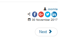
These parameters take care of the specificity of the information blocks.
Information details show only if they are allowed in the associated view.
| Force showing | When set to 'yes', will show the information if available, no matter what. It overrides the options that are set in the views or article settings - Does not apply to custom fields |
6.1+ Styles have moved to the Styles tab.
| Date | |||||||
|---|---|---|---|---|---|---|---|
| Show | The way the date will be presented
|
||||||
| Date format | The date format following the syntax explained at http://php.net/manual/en/function.date.php | ||||||
| Time | |||||||
| Time format | The time format following the syntax explained at http://php.net/manual/en/function.date.php | ||||||
| Ratings/Vote | |||||||
| Style | The way the vote system will show
|
||||||
| Star color | The color for the stars | ||||||
| Keywords | |||||||
| Distinct | Show the keywords as distinct entities, allowing for more complex skinning. Otherwise, the keywords will show as a comma separated list | ||||||
| Show icon | Show an icon before each keyword | ||||||
| Profiles Icon |
Select an icon that will override the default one | ||||||
| Prepend text | Text to show before each keyword | ||||||
| Tags | |||||||
| Order | The tags order
|
||||||
| Hide tags | Tags that should not show in the list of tags | ||||||
| Distinct | Show the tags as distinct entities, allowing for more complex skinning. Otherwise, the tags will show as a comma separated list | ||||||
| Show icon | When distinct, show an icon before each tag | ||||||
| Profiles Icon |
Select an icon that will override the default one | ||||||
| Prepend text | Text to show before each distinct tag | ||||||
| Use tag classes | Skin the distinct tags with classes that are set for each tag in the core Tagscomponent (does not apply to K2) |
||||||
Examples
|
|||||||
| Links | |||||||
| Show icon | Show an icon before each link | ||||||
| Profiles Icon |
Select an icon that will override the default one | ||||||
| Prepend text | Text to show before each link | ||||||
| Protocol | Show or hide the http:// or https:// | ||||||
| Example
|
|||||||
| Share Icons - the share links to show when using the information type 'Share icons' | |||||||
| Color | Give the share icons their official color
|
||||||
| Radius | The radius when there is a background (allowing the icons to have a rounded look) | ||||||
| Classes | Optional CSS classes to apply to each square icon
Example
|
||||||
| Free v5.5- Profiles v5.1- Include (6 items) |
Select which share service to show. The order in which the selections are made will determine the order on the site
|
||||||
| Free v5.6+ Profiles v5.2+ Share buttons |
Unlimited set of share buttons you can dynamically order
All icons use the SVG format. Originals have been downloaded from fontawesome.com and are licensed under the Creative Commons Attribution 4.0 International license |
||||||
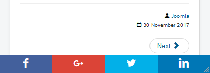
| Profiles Fixed footer |
In mobile mode, fix shared icons at the bottom of the page


|
||||||


 distinct tags using each tag associated CSS classes
 tag list with override of the separator


