All parameters related to every slide.
Content
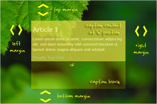
| Top margin | The minimum space (in percentages) between the top of the slide and the caption block | ||||||||||||||||
| Right margin | The minimum space (in percentages) between the right of the slide and the caption block | ||||||||||||||||
| Bottom margin | The minimum space (in percentages) between the bottom of the slide and the caption block | ||||||||||||||||
| Left margin | The minimum space (in percentages) between the left of the slide and the caption block | ||||||||||||||||
 |
|||||||||||||||||
| Text padding | The padding of the text (in percentages) inside the caption’s container | ||||||||||||||||
| Background opacity | The opacity of the caption’s background | ||||||||||||||||
| Background color | The caption’s background color | ||||||||||||||||
| Default position | The position applied to the caption inside the caption’s container by default
Check the caption configurations section for more information. |
||||||||||||||||
| Category header tag | When set to show, the HTML header tag for the category (will match the template) | ||||||||||||||||
| Title header tag | When set to show, the HTML header tag for the title (will match the template) | ||||||||||||||||
| Mobile | |||||||||||||||||
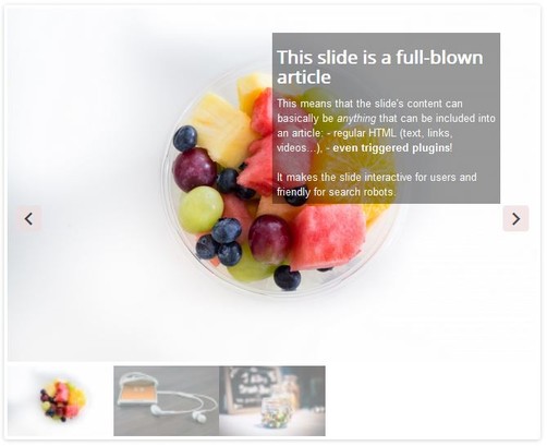
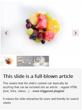
| Below slider | Show the slide caption content below the slideshow when the viewport is smaller than 640 pixels | ||||||||||||||||
On a large device: On a small device:  |
|||||||||||||||||
| CSS class | CSS class to give to slide content (caption and tooltips) that shows outside of the slideshow | ||||||||||||||||
Background image
| Default background | The image that will be used if it is missing from the data source (for instance, if the article fulltext image from an article or the K2 image from a K2 item are missing) |
| Image |
|
| Image width | The width of the original slide (images found to create the slide will be cropped if not of this width) |
| Image height | The height of the original slide (images found to create the slide will be cropped if not of this height) |
| Mime type | The mime type of the generated image. When no option is available, the image is of the same type of the original |
| Quality .jpg | The quality for the .jpg image (0..100). 100 has best picture quality but image file weight is the biggest |
| Quality .png | The compression for the .png image (0..9). 0 has best picture quality (no compression) but image file weight is the biggest |
| Quality .webp | The quality for the .webp image (0..100). 100 has best picture quality but image file weight is the biggest Note that when an image of WebP type is encountered, a fallback image is also created. WebP support requires PHP 7.1 minimum when using the GD extension |
| Quality .avif | The compression for the .avif image (0..100). 100 has best picture quality but image file size is the biggest. Note that when an image of Avif type is encountered, a fallback image is also created. Avif support requires PHP 8.1 minimum when using the GD extension |
The extension handles .jpg, .png, .webp and v2.3 .avif image file types.
When a WebP or Avif image is used, fallbacks are automatically created ONLY if the image width and height are different from the slide background image dimensions (you can choose between jpg or png as a fallback option in the advanced tab).
When the dimensions are identical, you need to provide a png or a jpg image fallback in the same directory as the original image (the extension will pick the one fallback you have included, whichever type it has).
It is highly recommended to use images that have the same dimensions as the dimensions provided here.
This allows you to have total control over the 'weight' of each image (and bypass the extension's automatic image creation), which will ensure faster page loads if your images are highly optimized. The GD library does not always make a good job in creating large optimized images (especially png files).
Responsive Slides
The extension can create images of different sizes which will be later used depending on the size of the browser window. Set strategic breakpoints that work best for your designs.
For instance, a breakpoint of value 768 will automatically generate an image of width 768 pixels, which will be used if the window size is less than 768 pixels. The browser will only load the appropriate image.
v2.0 Under the hood, the <picture> HTML element is used in conjonction with media queries.
| Use breakpoints | Use different image sizes for each slide when the slider is viewed on smaller devices (like mobile phones or tablets) |
| Breakpoint 1 | Image size to accommodate the smallest devices default 360px. v2.0 Set to 0 to ignore this breakpoint |
| Breakpoint 2 | Image size to accommodate the medium-size devices default 780px. v2.0 Set to 0 to ignore this breakpoint |
| Breakpoint 3 | Image size to accommodate the largest devices default 1024px. v2.0 Set to 0 to ignore this breakpoint |
The order of the breakpoints is not important. The extension will make the proper adjustments.
v2.0 When by-passing the extension's automatic image creation, you also need to provide the breakpoint images in the same directory.
For instance, if the original image is called original.png and you are using a breakpoint at 768px, you need to provide original-768.png.
If the original image is called original.webp and you are using a breakpoint at 768px, you need to provide original-768.webp AND the fallback original-768.png or original-768.jpg.


