There are many ways you can ensure items are showing on a page in a responsive fashion with Latest News Enhanced. Although some solutions can be used out-of-the-box, others may require additional CSS. It is also possible to use different techniques together for a better resolution.
Using item widths in percentages
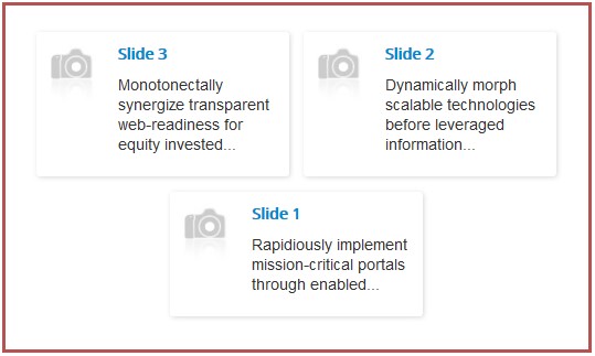
When widths are set in percentages, you actually determine how many items will be shown in a row of their container. For instance, giving a width of 30% will ensure 3 items will show on a single row, leaving about 3.3% for margins around each item.
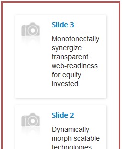
Add a minimum item width and the items will stop shrinking once that value has been reached when the container is scaled down.

Enabling text wrap
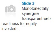
In the layout tab, under the text section, the wrap parameter allows the text to wrap around the head of an item. That feature is limited to the themes that allow it.
Using animations (pro version of the extension)
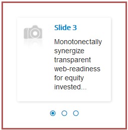
Animations handle responsiveness on their own. Give the items a width in pixels, an arbitrary value that will be adjusted by the animation script. The number of items on a row is determined by the number of visible items you have set (in the animation / pagination tab). If the script can't fit the items, it automatically reduces the number of visible items to fit the container.

Problem: using large images
Using larger images may sometimes introduce new challenges.

An issue arises: while wrapping around the image, the introductory text is pushed under the image, but the title is staying on the side. This is how html elements flow around each other. As long as there is space, that space is filled.

A simple solution is to ensure the title will not resize down to a certain width, forcing it to move under the image.
.newstitle { min-width: 150px; display: inline-block; }This additional CSS forces the title to be at least 150 pixels wide. For this width to be actually usable, the element itself must be an inline block.

As new use cases come to light, I will keep adding solutions you may use to improve responsiveness on your site.

