
Trombinoscope Contacts v4.0 brought up a number of improvements, one of which being a new way to improve the readability of contact information on smaller screens, mobile devices or when resizing the browser window down.
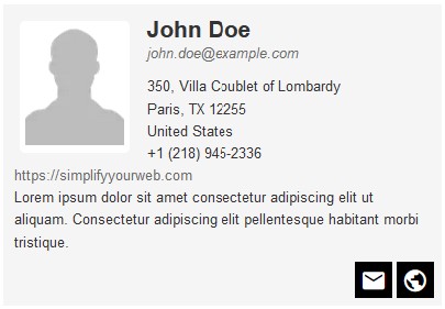
Here you are: you have set up the contact card information in a module instance (or in one of the directory views available in the pro version). It looks good right now in your browser window.
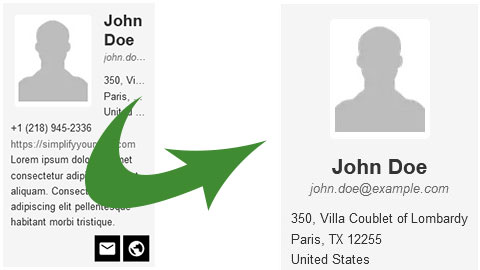
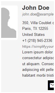
You are experimenting on different window sizes and realize the layout does not look quite as good when the contact card's container shrinks. The information starts to get cut-off and becomes difficult, even impossible, to read.
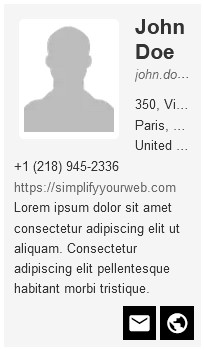
One fix would be to add a minimum width to the cards (in the layout tab), to ensure they don't go down a certain size. Yes, but what if that size is still larger than a mobile device or the cards container can show? You can end up with a card that is cropped, with maybe scrollbars to allow full visibility. Still far from ideal.
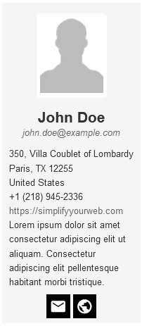
There is one other solution that consists on switching from a landscape layout to a portrait layout, moving the contact picture to the top.
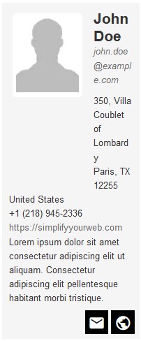
In the Picture tab, find the Orientation Switch Width parameter. Set the width under which the card in landscape mode should turn into a card in portrait mode, giving plenty of room to the contact information, below the picture.
Experiment with different widths and see what works best for your design and for the visitors of your site.