The administrator console user interface has been greatly improved in Joomla! 4. Focus has been made on accessibility and mobile-first experience.
While moving my own extensions to Joomla 4, I dug into the differences in the look and feel of radio buttons and list fields to ensure they would have a cohesive look throughout.
The radio field
The is probably the most obvious change. When it comes to skinning radio buttons in Joomla 3, the code would be:
<field name="protocol" type="radio" default="0" class="btn-group" label="..." description="...">
    <option value="0">JNO</option>
    <option value="1">JYES</option>
</field>
Adding the class btn-group-yesno would alter the output slightly:

Joomla 4 relies more on layouts (which allow all sorts of overrides) and introduced the switcher layout, which can only be used when radio buttons portray 2 states (yes/no, show/hide...).
<field name="protocol" type="radio" default="0" layout="joomla.form.field.radio.switcher" label="..." description="...">
    <option value="0">JNO</option>
    <option value="1">JYES</option>
</field>
The list field
The list field is used when the number of elements to choose from is bigger than 2. Although Joomla 3 allows the use of radio buttons for more than 2 elements, Joomla 4 restricts that number to 2 when using the switcher layout (but nothing prevents you to keep the standard html look).
Single selection
When using a list for a single selection, the field is skinned by default by the template. It is possible, however, to skin elements individually, if they have such values as 0, 1, 2...
In Joomla 3, to skin such a list, you would write:
<field name="show_errors" type="list" class="chzn-color-state" useglobal="true" label="..." description="...">
    <option value="0">JNO</option>
    <option value="1">JYES</option>
</field>
The skinning relies on the Chosen script, used throughout Joomla 3's interface (Chosen is a javascript library used to beautify list fields).
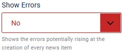
In Joomla 4, it is just a matter of replacing the Joomla 3 class with form-select-color-state to obtain:

Multiple selection
A good example of a multiple select field is the category field. In Joomla 3, you would code the field like this:
<field name="catid" type="category" extension="com_content" multiple="true" size="5" default="all" label="..." description="...">
    <option value="all">JOPTION_ALL_CATEGORIES</option>
</field>
In Joomla 4, adding the list-fancy-select layout will skin the field properly:
<field name="catid" type="category" extension="com_content" multiple="true" size="5" layout="joomla.form.field.list-fancy-select" default="all" label="..." description="...">
    <option value="all">JOPTION_ALL_CATEGORIES</option>
</field>
Without the layout, you will get the standard html multiple list.
Custom selection
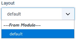
Some lists may require special attention. For instance, the modulelayout field (which is a list of all layouts available for a module), does not require any special 'treatment' in Joomla 3. Under Joomla 4, however, the field will not look quite right without adding the form-select class.

In conclusion
These are the most significant differences I came across and changes may still be possible before the actual Joomla 4 release. Form fields have received a much needed 'refresh' and hopefully more developers will follow and use the Joomla 4 standard fields that are available. It is important that the overall user experience remains consistant throughout the interface.
Joomla 4 beta 7 custom-select has been replaced with form-select

