In many situations, the main menu of a site may be too big for consumption on a mobile device. One of the many techniques to make a menu responsive and mobile-friendly, is to have the menu transform into a 'hamburger'-style icon (hence, the 'hamburger' menu name) once the site's viewport becomes too small.
The selection of the hamburger icon then results in the opening of a pane, which contains the then hidden menu.
The Bare 960 Responsive template features that functionality out of the box.
Under Joomla 4
There are a few simple steps necessary to transform a menu into a hamburger menu with a sliding pane.
Create a module instance of 'Menu' type
Set the parameters as you would for any menu in Joomla.
In the Advanced tab, go all the way down to the 'Module Style' parameter and select the style, Hamburger. This will tell the template that this menu will become a hamburger menu (the hamburger style can only be used once on a page).

Most likely, you would keep the menu layout to its 'Default' value or use the default layout, with description (see the Menu Layouts section of the documentation for the template).
Duplicate the module
Once saved, save the same module 'as copy'.
This time, set the position to the copy of the module to slidemenu-content.

In the Advanced tab, go all the way down to the 'Module Style' parameter and de-select the style 'Hamburger'. Set it to Sidepane.
Set the menu layout to 'Menu items in a raw layout'.
To add expandable sub-menu functionality, use the pre or the post class. Add the class to the 'Menu class' parameter (see the Menu Classes section of the documentation for the template). Add the flex-column class to ensure the items remain all in a single column.
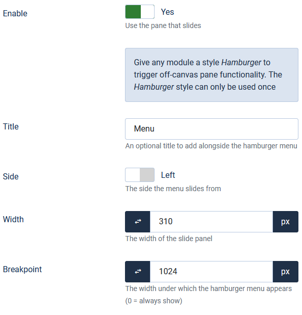
Set the parameters in the Slide Pane tab of the template

Enable the pane, add an optional text to the hamburger icon, decide if the panel should open on the right or the left, it's width, and finally under which width the menu will transform into the icon.


